Permissions Capture
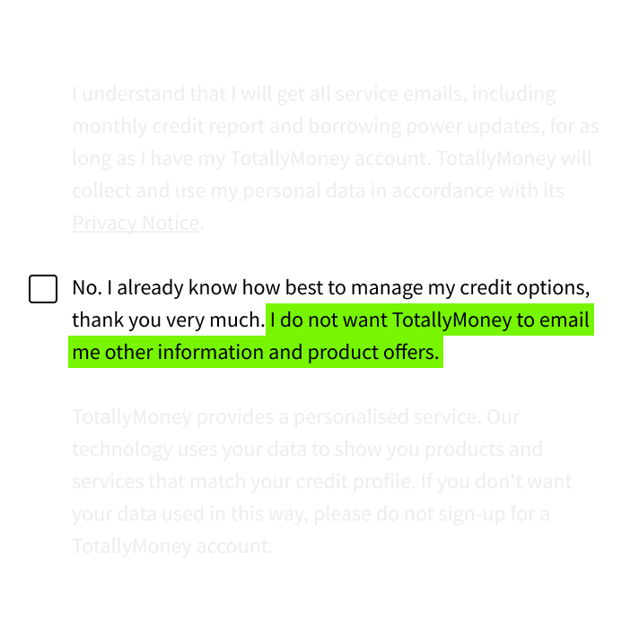
Before GDPR, the product relied on "soft opt-in" for marketing communications during registration, resulting in 100% marketing-enabled customers. But what happens after GDPR?

UX/UI Designer, Researcher, Strategist
1.5 years
In July 2018, I joined Totally Money, a startup focused on helping users understand their credit scores and borrowing power in the UK. I was their first UX hire.
As the squad's sole designer, I initially worked on the Credit Report area and later transitioned to Offers. Each squad included a product owner and developers.
I worked on various projects, a few of which are highlighted below:
Permissions Capture
Microfeedback
Before GDPR, the product relied on "soft opt-in" for marketing communications during registration, resulting in 100% marketing-enabled customers. But what happens after GDPR?

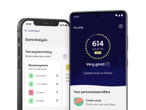
We launched the Credit Report Analysis feature to show historical factors affecting credit. A month later, we saw a 45% increase in users accessing their reports, with significant engagement increases in other key metrics. However we didn't know why.
View the full project
UX/UI designer
Jorge Bastos, Elisabeth Hansen
Before deploying the feature of Credit Report Analysis the Credit Score was a mistery. Once deployed we didn't to know if users had a better grasp.

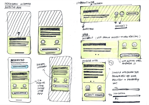
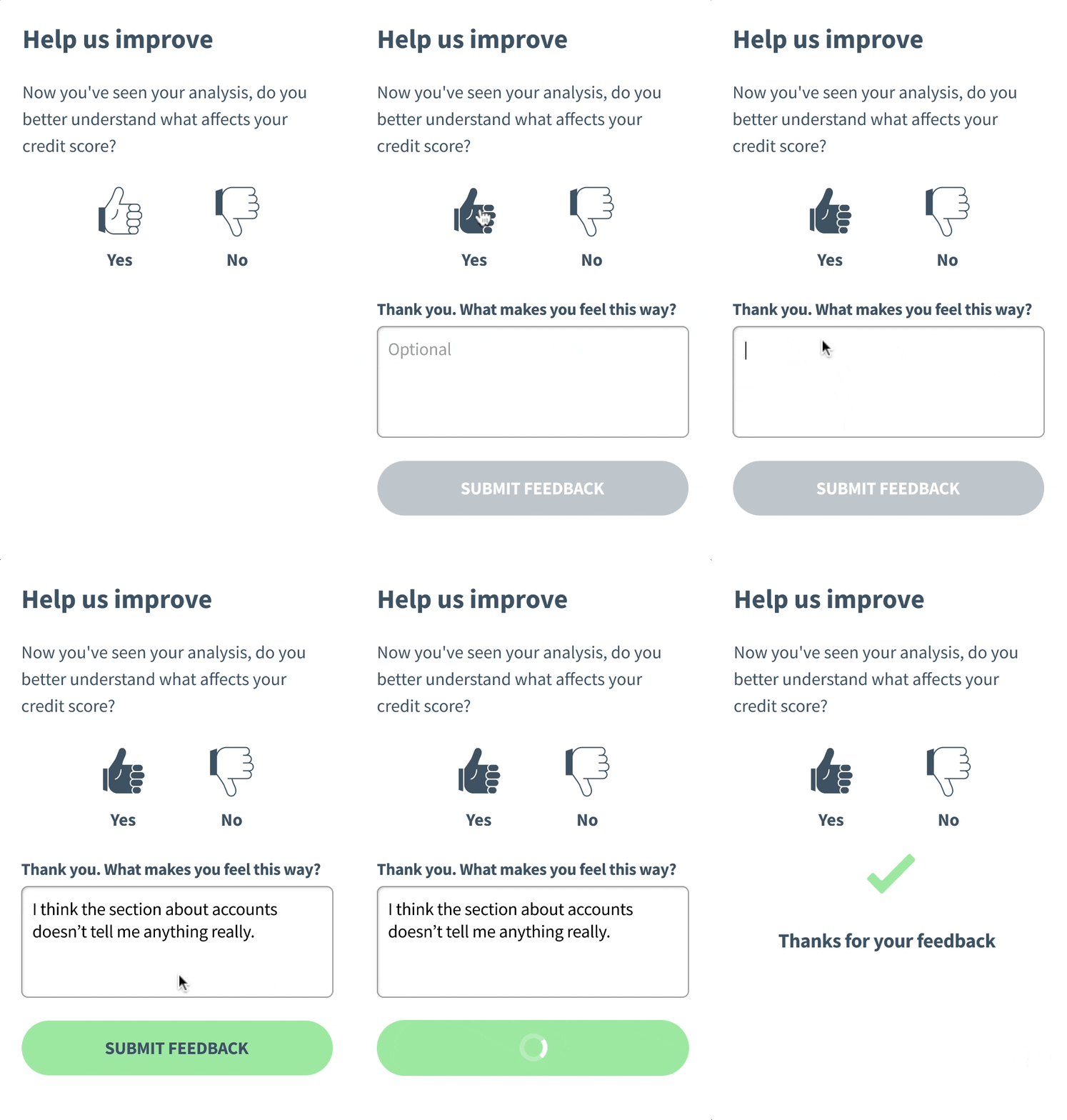
Drafting the questions I realised the Feedback would confirm that the Credit Report taught users about their what affected their score. I revamped the feedback wizard’s look and feel to align with the current style and enhance usability.

I selected the 2 questions by consulting with stakeholders on the type of feedback we were looking for. To ensure the devs implemented the feature according to the design I built a prototype and tested interactions across different screens.

When asked, “Do you think this Analysis can help improve your credit score?” more respondents answered yes than no, though few provided reasons for their answers.
Running the feedback wizard was useful to validate the value of the Credit Report Analysis.
Totally money sends Abandoned Cart emails 24h after users browse credit card offers. A follow up email is sent 7 days after.
The marketing team initiated an A/B test to optimize the grace period to see if the conversion rate would increase above 17%. They tested the control changing the follow up from 7 days after, to 14 days and finally to 30 days. None of the follow up options times changed the conversion significantly.
