×
Investec
coming soon
Fiserv Totally Money The AA Maserati Archive
Fiserv merchant portal interface on desktop and mobile view

Fiserv

A design system to elevate design efforts company-wide

Tags
Design System Component Library Design Principles Component audit
Role

IA, UX/UI Design, Design QA

Credits

Christer Papanicolau, Tatiana Gushchenko, Beuno David, Carlos Montoya, Pontus Persson

Intro

Fiserv is a multinational financial company that provides payment solutions for a broad size range of companies around the world. They develop software and hardware products like POS card readers and soft point of sales mobile apps.

Fiserv partnered with Class35 to initiate a digital transformation journey as they noticed that they were lagging behind their competitors.

Because of the lack of internal design team capacity to assume more work, our team was initially tasked to help them create a design system for their Merchant portal.

Problem Statement

Problems identified by the client:

The lack of consistent, agreed, verified, and well-documented components, led to design and development debt. The components were duplicated, versioned without documentation, and agreed on a project but not publicly available, although the extent of the problem was not fully exposed.

The problems we found:

Product owners dictated how to execute design implementations. Their focus on speed led them to cut corners on design. Design inconsistencies carried on due to that.

Developers were very influential in shaping how to design the components. Developers created the components according to what they were comfortable doing, not what the components needed to do.

There wasn't much governance of the components. The components found in the design files looked and behaved differently from the development when compared side by side.

The design team considered the components in isolation. Consequently, they fit in one context of use and fail in others.

The project brief requirements were poorly defined. As a result, designers had to put a lot of effort into seeking clarity.

Fiserv's merchant portal preauthorisations page before being redesigned

Fiserv merchant portal before the redesign

Scope & Constrains

Initial scope

- Creating a component library in 3 months.

Constraints

- Minimal UX fixes: We could only change the UI but not change IA or flows.
- Lack of access to the software.
- Initial client rigidity in granting us access to the developer environment and necessary files.
- Lack of design documentation.
- Naming conventions hindered the search for adequate files.

Process

Initially, our approach was to get to know the task, and the team, and document anything that was not working. We found that the lack of documentation, and the fact that the design team considered the components in isolation could hinder the outcome and our collaboration with the Fiserv.

Once we pointed out the problems to the client. We changed our approach. We needed to understand the Merchant Portal as a hole before declaring the already designed components done.

I mapped the IA to help us understand the breadth of the web app and because there wasn't one. As a result, we had a better understanding of the scope of our work.

I listed the menu items because not all merchants had the same number of items, and we needed to bulletproof the next design for the max number of items. Consequently, we knew all the pages we had to consider for the creation of components and how many items in the menu were needed.

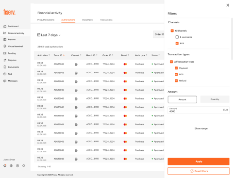
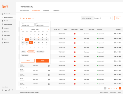
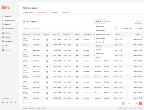
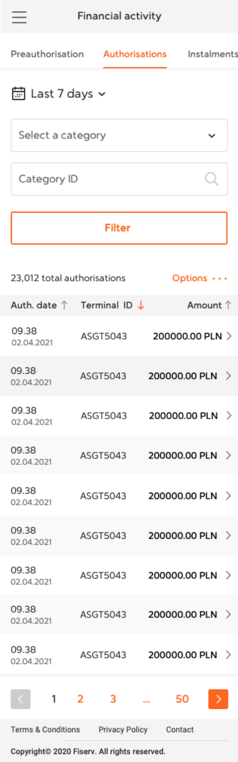
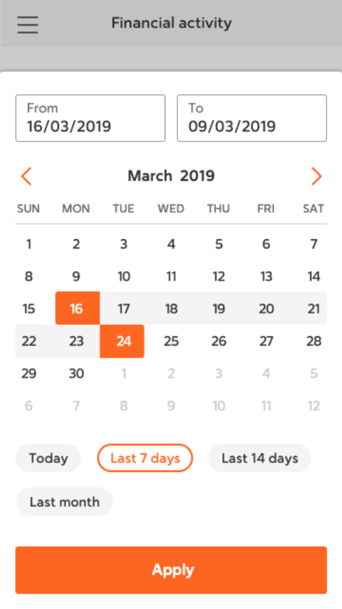
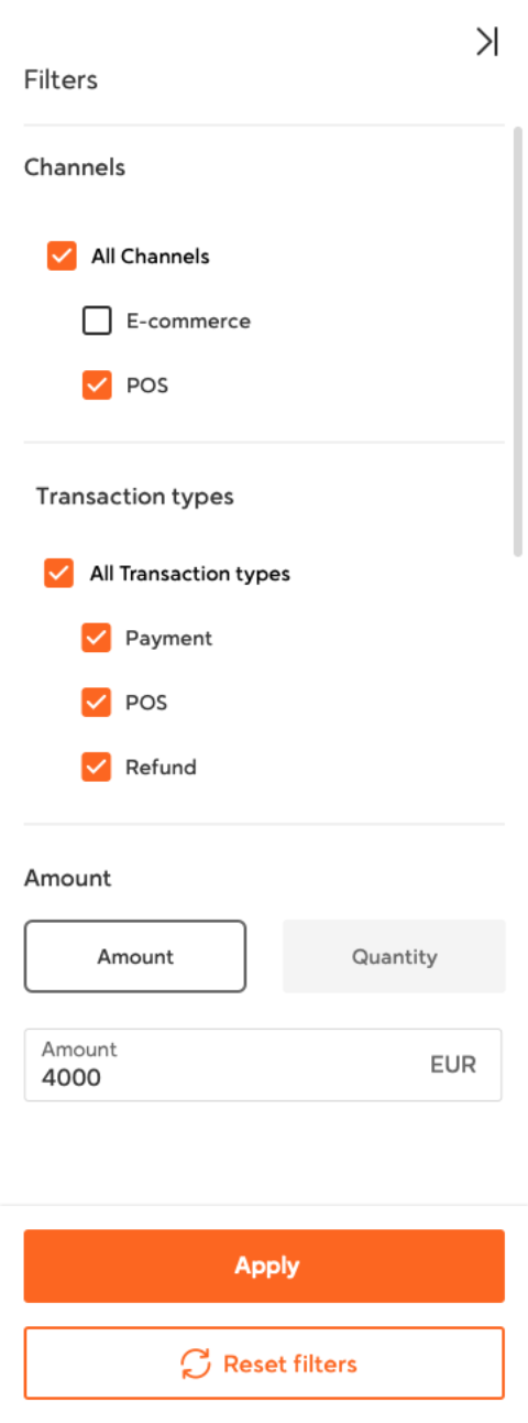
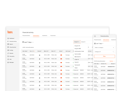
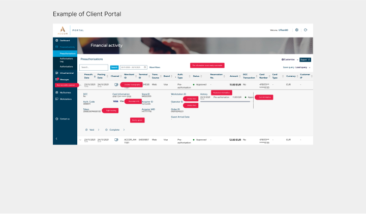
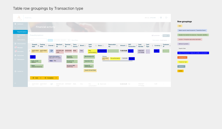
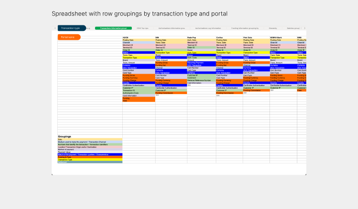
Explanation of the process that was followed to map the information on the separate table types

I mapped key flows to devise how deep the page hierarchy went. Based on that, we created, components that weren't considered by the client initially, and solved UX labelling problems.

I mapped all the information contained on the rows on the different table types. When we saw how the expanded version of arrow displayed information we felt that the layout made it confusing to read, and that the information lacked categorisation. As a result I designed a different way to show the information in a clear and concise and consistent manner.

Shows the process taken to design the expanded information in a row

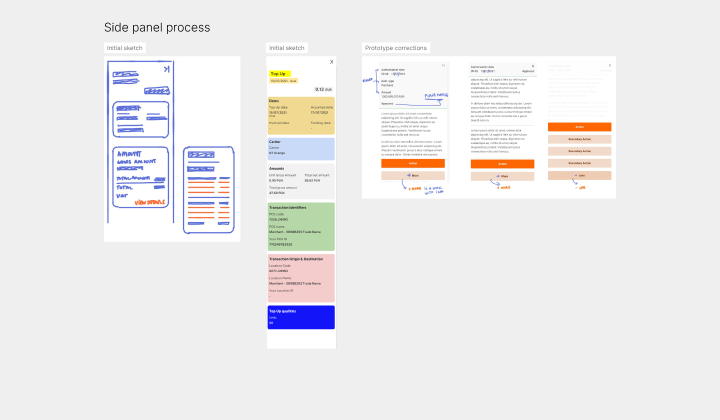
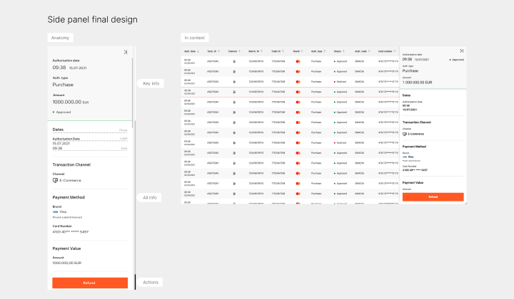
Recorded explanation of how the Panel sliding component was designed

I created mock-ups to see how components would behave. The behaviors were documented on the storybook and handed to the developers.

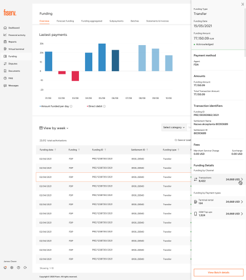
Panel Sliding initial prototype

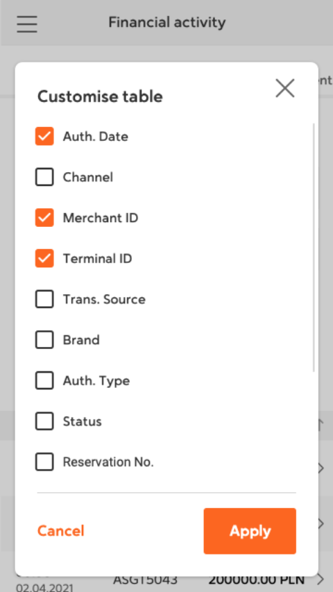
We audited each an every component created during the revamp of the Merchant Portal. To identify duplicates, variations of the same component, solidify the naming conventions and keep an inventory for the dev team to create their backlog. This helped our in house team of developers to structure the storybook.

Design System Documentation video tour

Outcomes and Lessons

Outcomes

We delivered the first iteration of the design system that consisted of:

- Component Library in Sketch documented with use cases, states, etc.
- A storybook version of the component library.
- Backlog of listed components that included statuses, links to storybook and sketch file.
- Updated designs in sketch.

Lessons

We couldn't solve all the cultural problems that we initially found, those required more time. However, the implementation of the design system saved the team time to design and gave a needed consistency to the outcomes.

I pushed several times to use Figma instead of Sketch. However, this was not possible because of their current process. Months after I heard it was implemented. You have to persevere for the best outcome.

Desktop

Image of the Funding section on the fiserv merchant portal with the side panel displaying all the information of a Image of the Funding section on the fiserv merchant portal
Description of image 2 Description of image 2

Mobile

Description of image 1 Description of image 2 Description of image 2 Description of image 2

previous project

Investec

next project

TotallyMoney